Projects
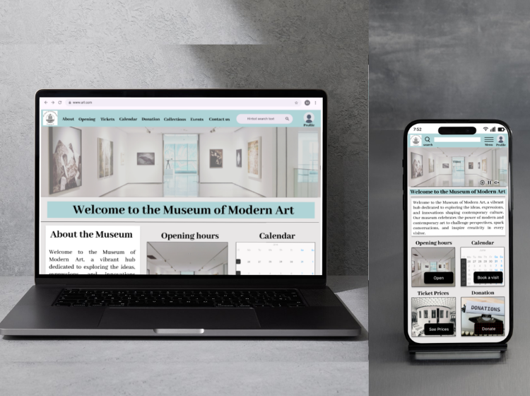
Museum application and responsive website
The Product:
Design an app and a responsive website for a public art museum to advertise exhibitions and events, provide museum information to patrons, and enable patrons to schedule visits.
Duration:
2 month
Project Overview
The problem
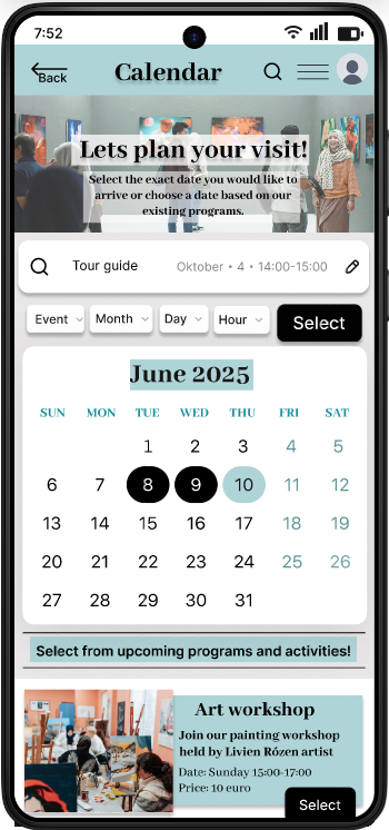
Museum visitors could not plan their visits online, for that I designed an interactive calendar and an appointment booking platform.
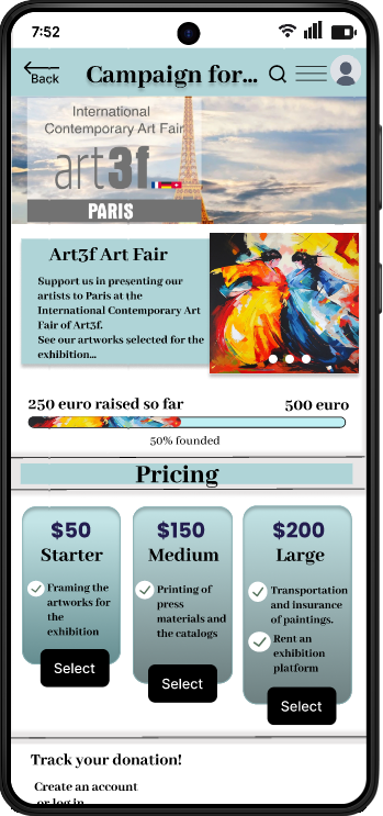
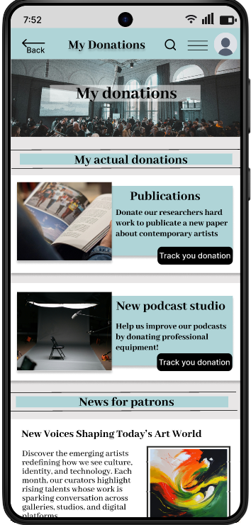
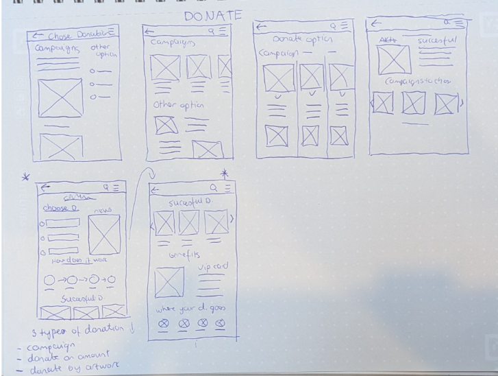
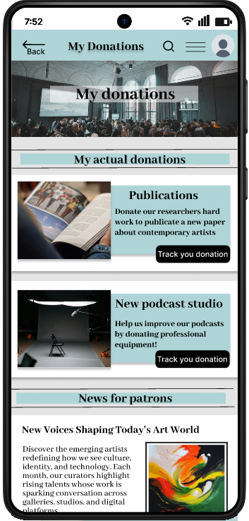
There was no option for patrons to organize their donations online and track the process. I created a detailed, transparent donation platform that keeps the patrons interested.
The goal
My goal was to create two feature for a museum app that helps the visitors to plan their visits and patrons to organize their donations. Accessibility considerations play a big role in my design process.
User Research
Summary
Goal: Identify key museum patrons and their pain points.
Method: Secondary research followed by interviews with collectors, art historians, and professors.
Insights: Users struggle to track current museum events and lack a centralized platform for managing professional collaborations.
User Personas
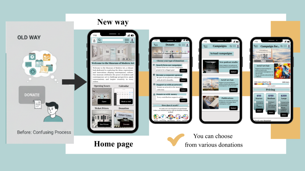
User Pain Points & Strategic Solutions
1. Pain Point
Solution
2. Pain Point
Solution
3. Pain Point
Solution
4. Pain Point
Solution
Wireframes
Paper wireframes
Homepage: From Concepts to Layouts
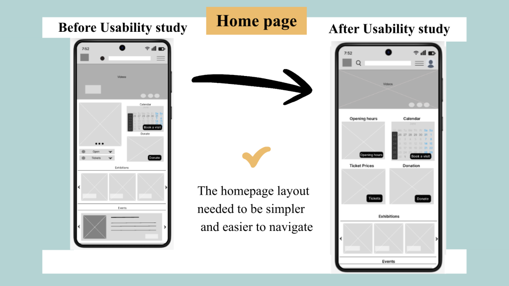
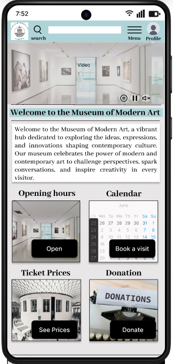
My goal was to create an organized, high-utility homepage. Through rapid paper prototyping, I iterated on the placement of key features like the calendar and donation platform to ensure intuitive navigation.
Priority: Instant access to hours, pricing, and collections.
Result: A streamlined layout that merges the best elements from my sketches to simplify the user journey.
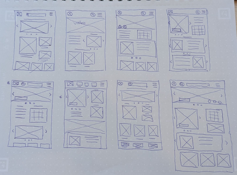
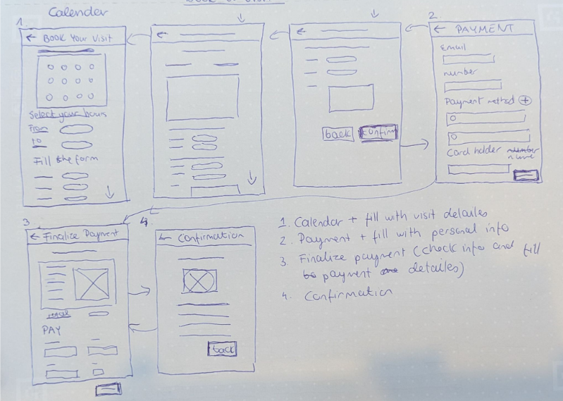
Paper wireframes for the museums two new feature: The calendar and donation.
Calendar:
Donation:
Digital Wireframes
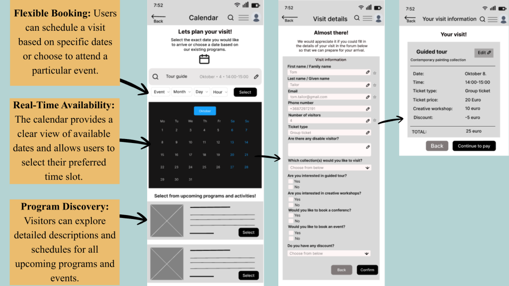
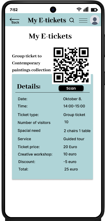
Feature: Streamlined Booking.
Users can filter by date or browse upcoming programs to maximize their experience. Once a time slot is selected, a brief intake form captures visit details and accessibility requirements, ensuring the museum is fully prepared for the guest’s arrival.
Usability study: Findings
During the usability study:
I interviewed five regular museum visitors from various ages and backgrounds.
Most participants were eager to use the app, though they offered several suggestions for improvement.
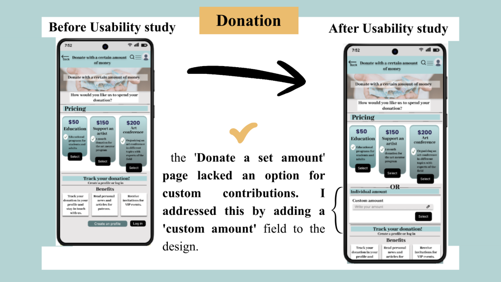
During the second usability study, participants expressed frustration with the donation flow
Mockups

Accessibility Considerations
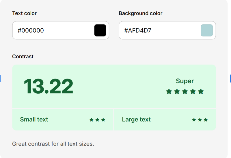
High Color Contrast
UI elements meet WCAG AA/AAA standards (using a minimum 4.5:1 ratio for text) to ensure users with low vision or color blindness can read content clearly.
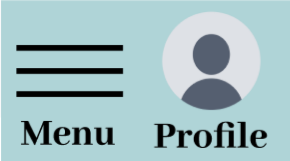
Alt Text for Icons:
I added descriptive alt text to icon-only buttons, ensuring assistive technologies like screen readers can convey the intended purpose to visually impaired users.
Consistent & Predictable Layouts:
I maintained consistent navigation patterns and action placements across all screens to reduce cognitive load and help users navigate intuitively.
Takeaways
Impact
The redesigned interface significantly improved user engagement.
Usability testing revealed that the strategic use of imagery and a refined visual hierarchy made the experience more intuitive.
Most notably, participants expressed a high intent to integrate the app into their daily routines, validating the product’s long-term value.
What I learned
This project reinforced the importance of user-centered problem solving.
The core of my process is now rooted in evidence-based design.
I’ve refined my ability to translate complex user pain points into streamlined, aesthetically pleasing interfaces that prioritize the user’s goals
My biggest takeaway was learning to bridge the gap between utility and delight.
