Design an app and a responsive website for a public art museum to showcase upcoming exhibitions and events, provide museum informations and enable patrons to track their donations and schedule their visits.
The Problem
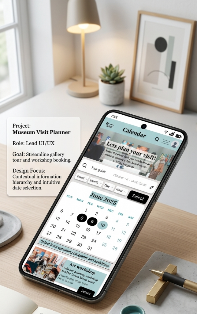
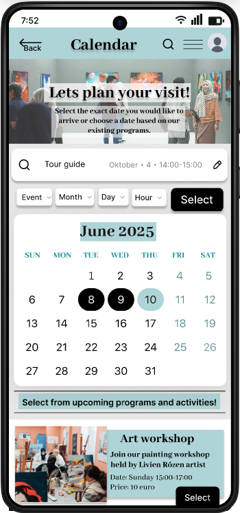
Museum visitors could not plan their visits online, for that I designed an interactive calendar and an appointment booking platform.
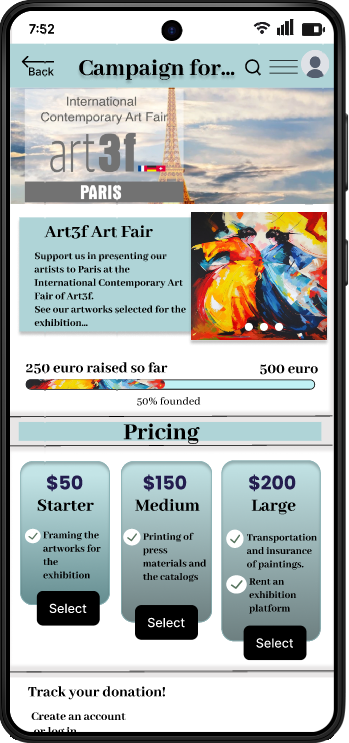
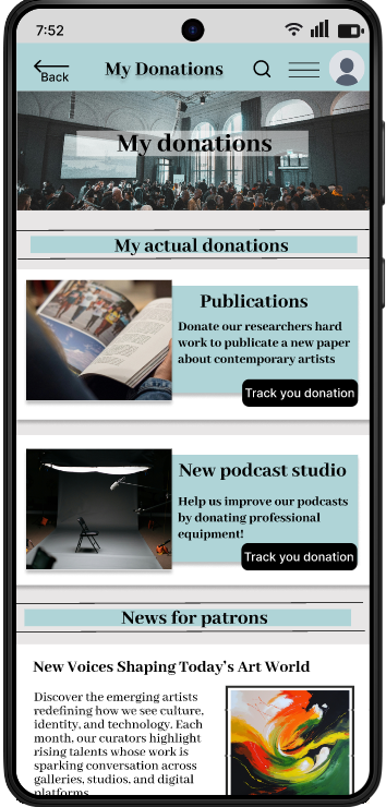
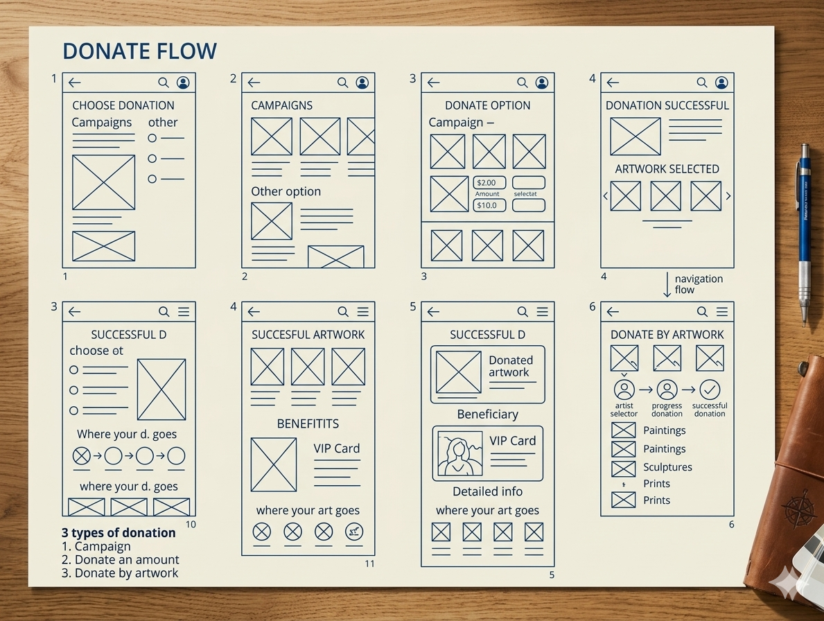
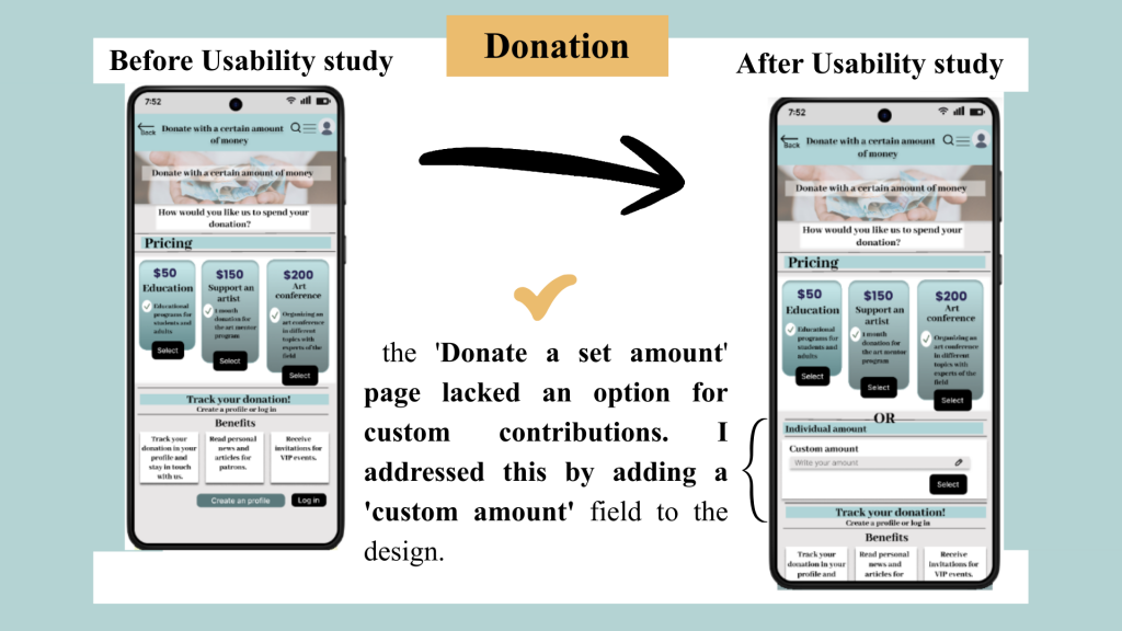
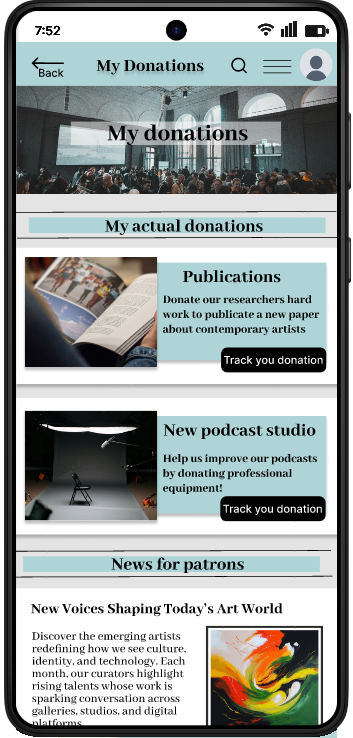
There was no option for patrons to organize their donations online and track the process. I created a detailed, transparent donation platform that keeps the patrons interested.
The goal
My goal was to create two feature for a museum app that helps the visitors to plan their visits and patrons to organize their donations. Accessibility considerations play a big role in my design process.
My Role
User Interface Designer
/ User Interaction Designer / User Researcher/ Project Lead
Responsibilities
User research /
Usability research /
Wireframing /
Prototyping (Low-fi, Hi-fi) /
Animation /
UX and UI design
User Research
Summary
Goal: Identify key museum patrons and their pain points.
Method: Secondary research followed by interviews with collectors, art historians, and professors.
Insights: Users struggle to track current museum events and lack a centralized platform for managing professional collaborations.
User Personas
User Pain Points & Strategic Solutions
1. Pain Point
Users lack clear information on current exhibitions and events.
Solution
Personalized notifications for upcoming events and interests.
2. Pain Point
Coordinating a museum visit is time-consuming and fragmented.
Solution
An integrated visit planner and streamlined online registration.
3. Pain Point
Fragmented tracking for diverse donation types and art loans.
Solution
A multi-channel donation interface for monetary gifts, artwork donations, and temporary loans.
4. Pain Point
Hard for users to stay updated on the latest art research and exhibitions.
Solution
An online art magazine feature with the latest researches and articles about the artworks/ exhibitions represented at the museum.
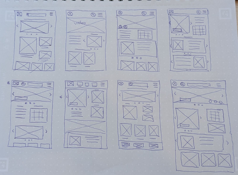
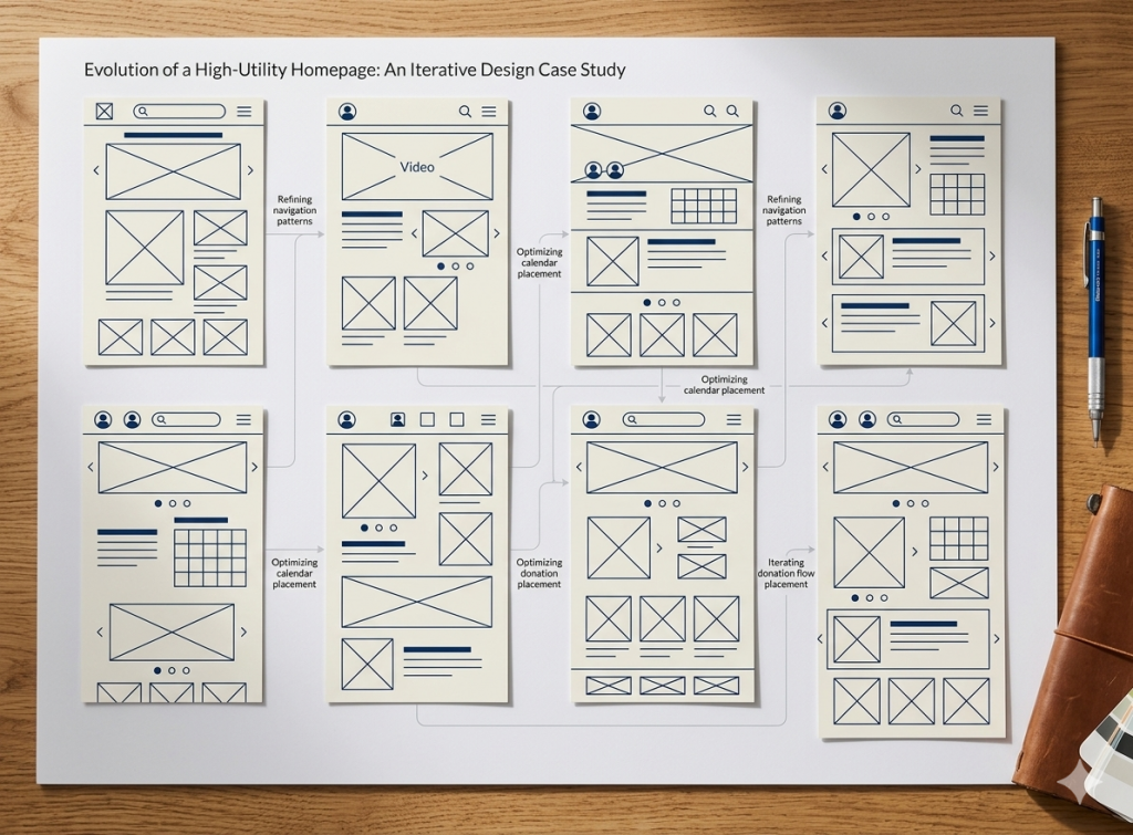
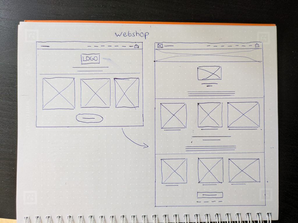
Wireframes
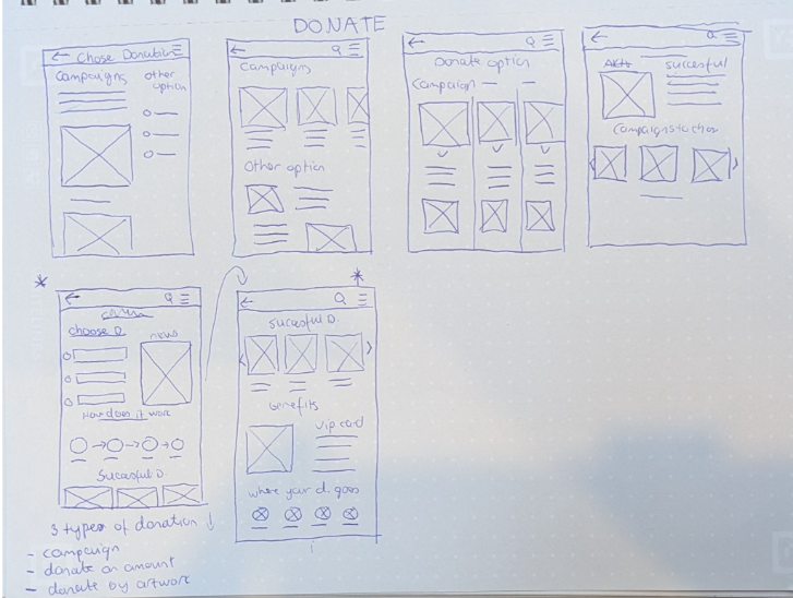
Paper wireframes
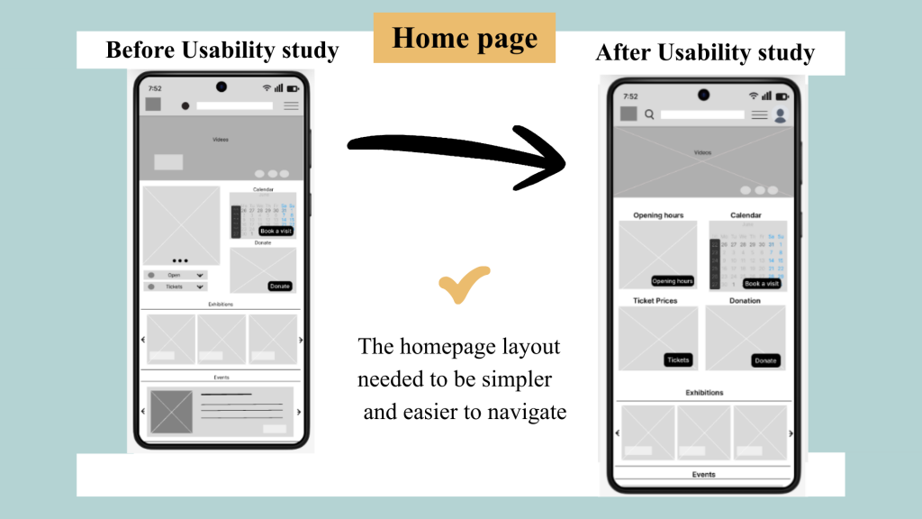
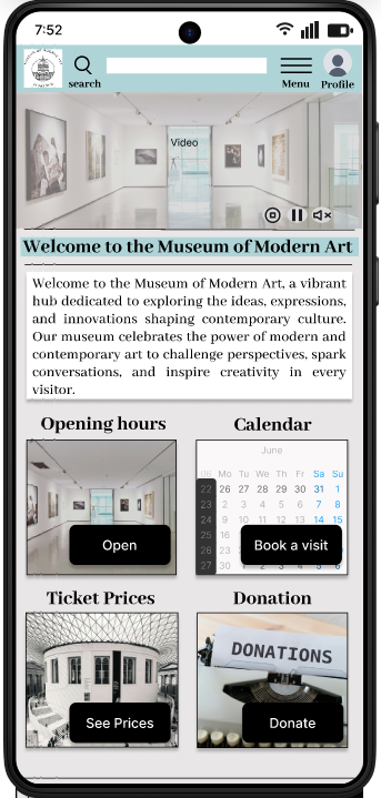
Homepage
My goal was to create an organized, high-utility homepage. Through rapid paper prototyping, I iterated on the placement of key features like the calendar and donation platform to ensure intuitive navigation.
Priority: Instant access to hours, pricing, and collections.
Result: A streamlined layout that merges the best elements from my sketches to simplify the user journey.
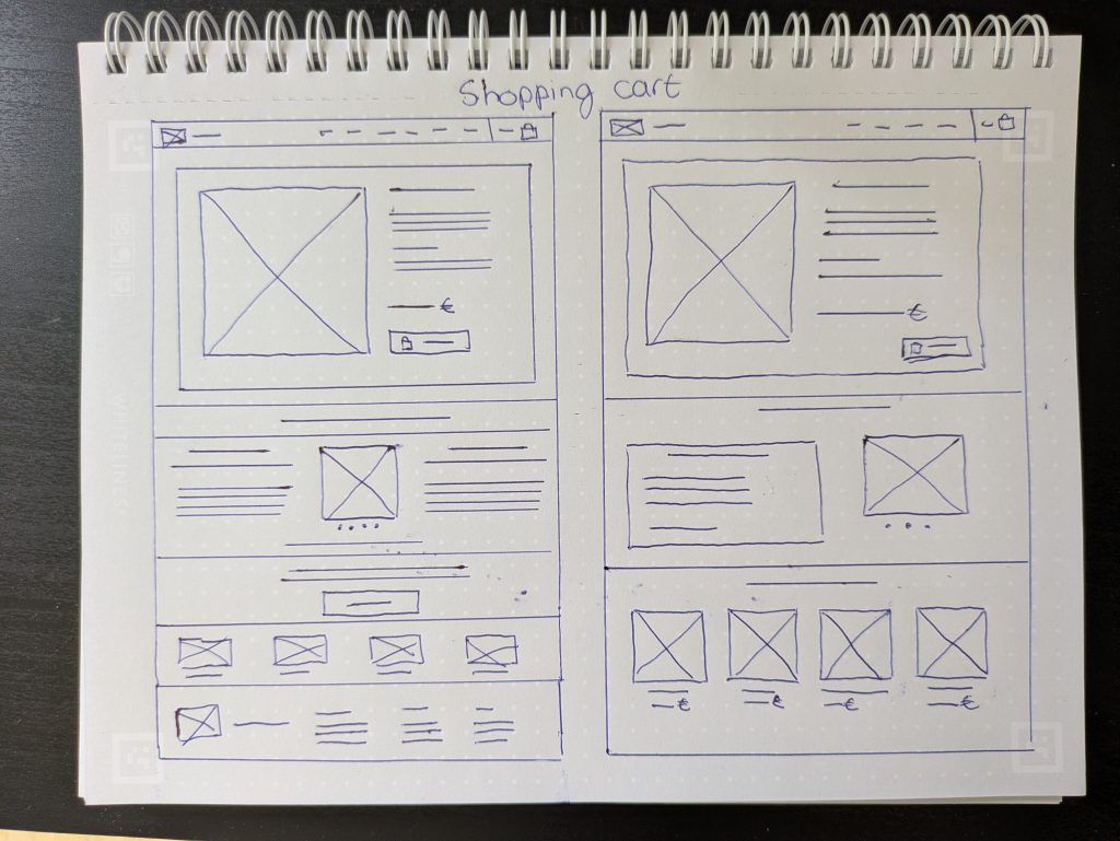
Low-Fidelity Sketches
I explored different homepage layouts on paper.
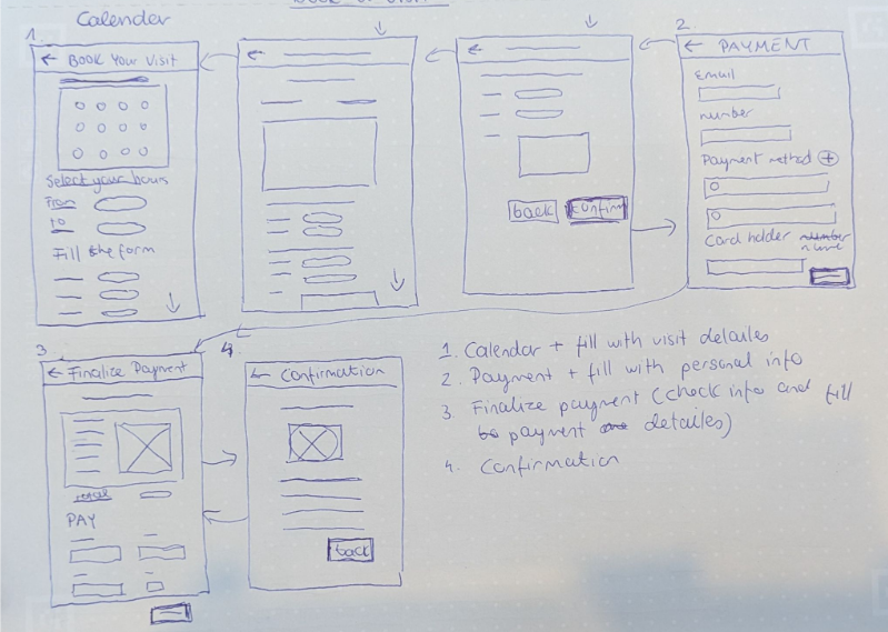
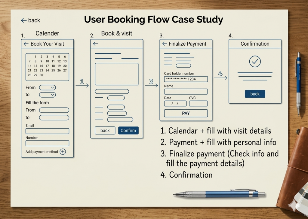
Wireframes for the Calendar and the Donation
Calendar
Donation
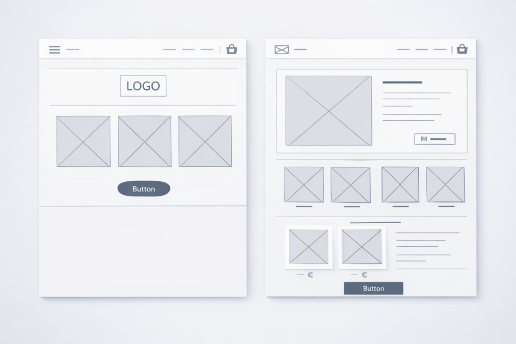
Digital Wireframes
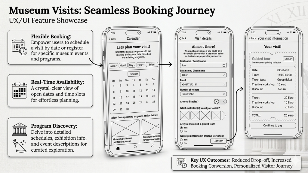
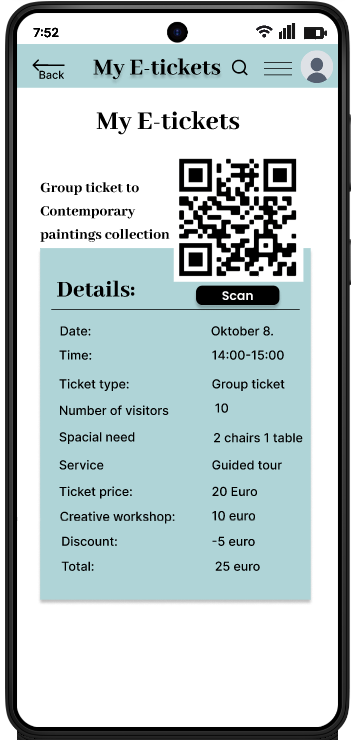
Streamlined Booking
Users can filter by date or browse upcoming programs to maximize their experience. Once a time slot is selected, a brief intake form captures visit details and accessibility requirements, ensuring the museum is fully prepared for the guest’s arrival.
Usability study: Findings
During the usability study:
I interviewed five regular museum visitors from various ages and backgrounds.
Most participants were eager to use the app, though they offered several suggestions for improvement.
During the second usability study, participants expressed frustration with the donation flow
Mockups
Accessibility Considerations
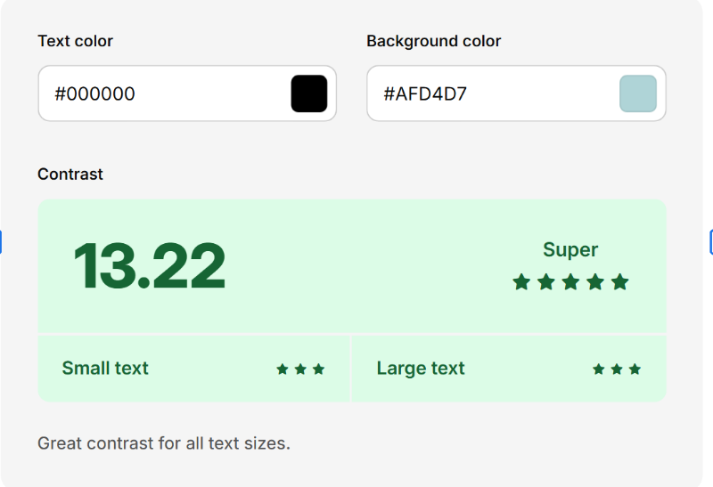
High Color Contrast
UI elements meet WCAG AA/AAA standards (using a minimum 4.5:1 ratio for text) to ensure users with low vision or color blindness can read content clearly.
Alt Text for Icons:
I added descriptive alt text to icon-only buttons, ensuring assistive technologies like screen readers can convey the intended purpose to visually impaired users.
Consistent & Predictable Layouts:
I maintained consistent navigation patterns and action placements across all screens to reduce cognitive load and help users navigate intuitively.
Takeaways
Impact
The redesigned interface significantly improved user engagement.
Usability testing revealed that the strategic use of imagery and a refined visual hierarchy made the experience more intuitive.
Most notably, participants expressed a high intent to integrate the app into their daily routines, validating the product’s long-term value.
What I learned
This project reinforced the importance of user-centered problem solving.
The core of my process is now rooted in evidence-based design.
I’ve refined my ability to translate complex user pain points into streamlined, aesthetically pleasing interfaces that prioritize the user’s goals
My biggest takeaway was learning to bridge the gap between utility and delight.
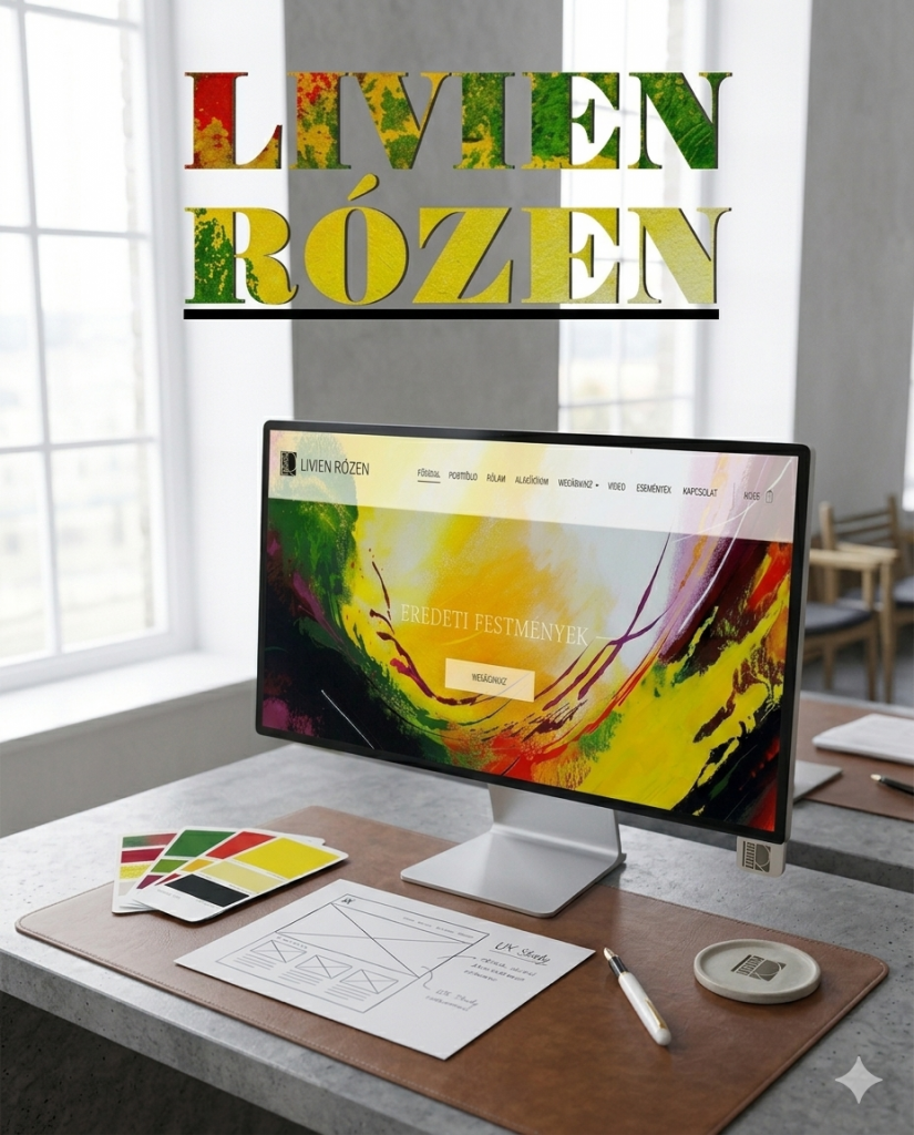
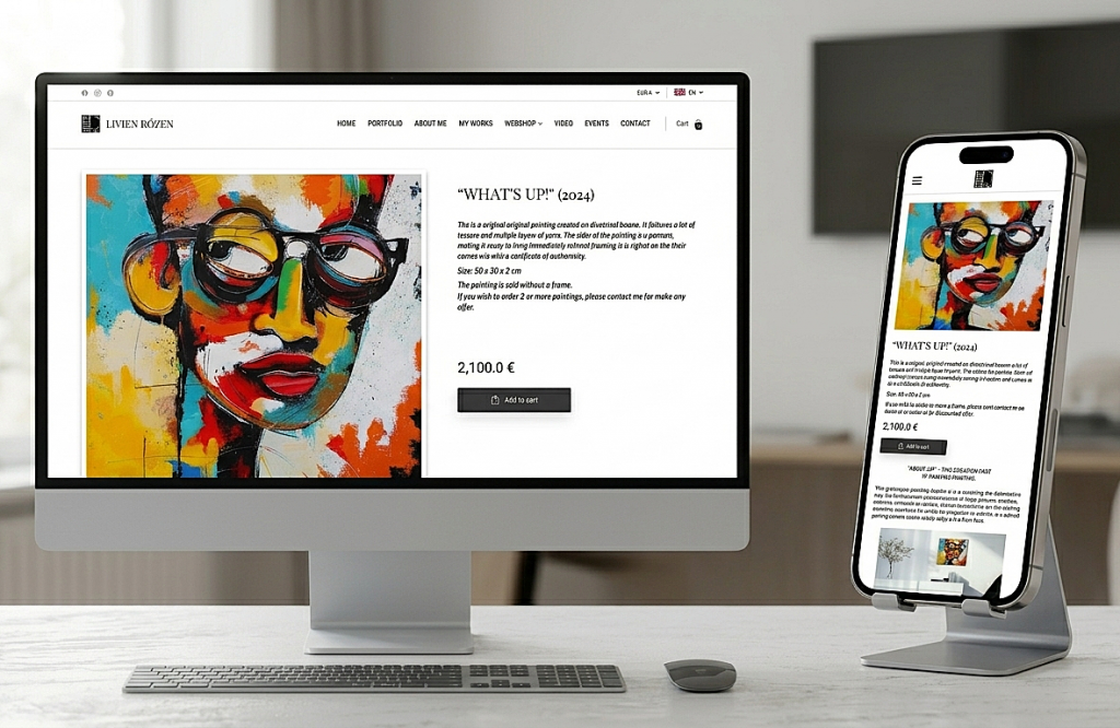
Livien Rózen Painter Portfolio Website and Webshop
Project Overview
The Project
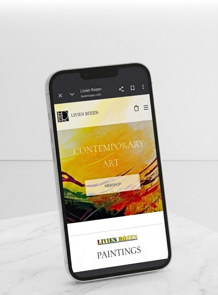
The product is a premium, responsive e-commerce platform designed for an internationally exhibited contemporary artist. It serves as a high-end digital gallery that utilizes expansive white space to showcase vibrant, textural artwork and unique techniques. The site features a seamless, multi-language interface to accommodate a global audience of curators and collectors.
The Problem
The artist lacked a dedicated digital presence, relying on fragmented platforms that failed to convey her professional standing. There was no central, high-end environment to unify her global exhibition history with a functional storefront, leaving international collectors without a trusted, cohesive space to experience and purchase her work.
The Goal
To design and launch a minimalist, responsive website that establishes a professional digital presence for the artist. The objective was to create a high-fidelity gallery environment that authentically showcases her work while integrating a seamless, multi-language e-commerce funnel to facilitate international sales and build brand authority from the ground up.
UX Design/ User Research/ Brand and Logo Design / Content Writer/ Curator
User Research
Goal
To understand the psychological triggers of high-end art collectors and identify the friction points in purchasing original fine art online, specifically for an artist with a strong international exhibition history but no prior web presence.
Methodology
I employed a mixed-methods approach to gather both emotional and functional insights:
Competitive Audit: Analyzed individual artist portfolios (e.g., secondary market stars) and marketplaces (Saatchi Art, Artfinder) to identify cognitive loads.
User Interviews : Spoke with 3 regular art collectors to understand what information they need before spending €2,000+ online.
Audit of Physical Exhibitions: Researched Livien’s past international exhibitions to translate the physical gallery feeling into digital patterns.
Insights
Reduced Cognitive Load
By using a minimalist UI with 60% more white space than standard e-commerce sites, I eliminated visual noise. This digital silence ensures the vibrant artwork remains the central focus, fostering a stronger emotional connection for the user.
Trust Through Authority
Showcasing international exhibition history is the primary driver for overcoming the skepticism of first-time buyers.
The Texture Requirement
Users need high-fidelity visual detail (zoom/video) to compensate for the inability see the textures.
Global Accessibility
Multi-language and multi-currency features are non-negotiable for reducing cart abandonment among international collectors.
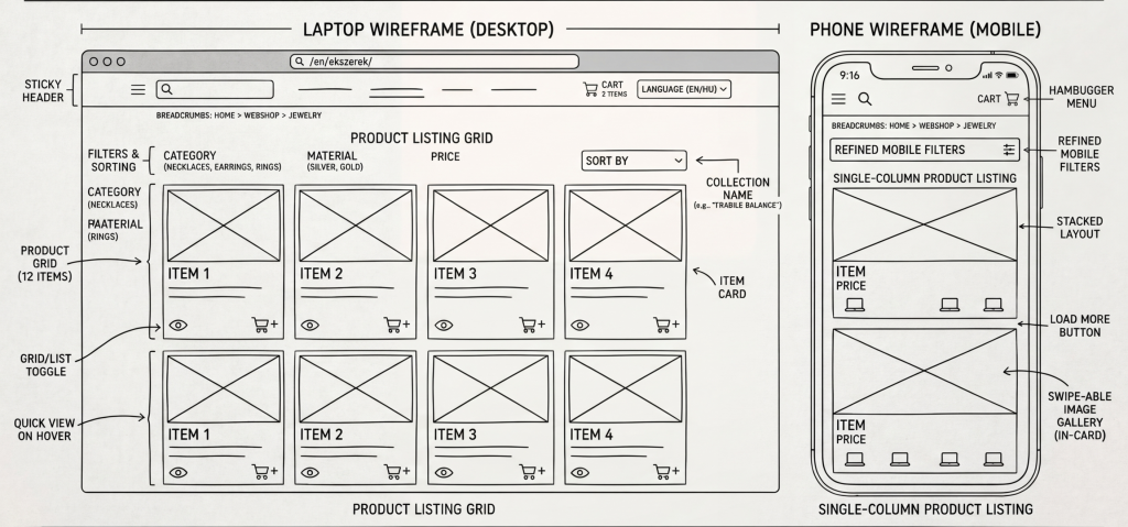
Wireframes
Webshop
Shopping cart
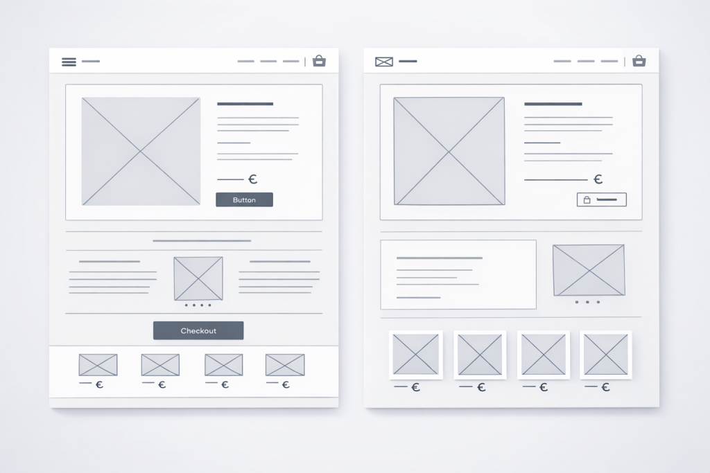
Mockups
Side-Drawer Access: Users can review their selection without leaving the gallery page, maintaining browsing momentum.
Immediate Trust Signals: High-value reassurances like “Free Global Shipping” and “14-Day Money Back Guarantee” are placed right next to the checkout button.
Integrated Currency/Language: Pricing and language settings are accessible directly within the cart utility, catering instantly to international collectors.
High-Quality Visuals: Large thumbnails ensure the emotional connection to the artwork is maintained during the final purchase step.
Minimalist Layout: Ample white space eliminates distractions, ensuring the vibrant artwork remains the sole focus.
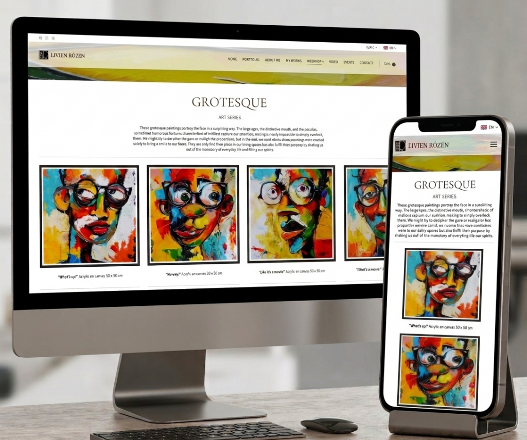
Narrative Navigation: Categorizing by Art Series (e.g., Grotesque) creates a gallery-like journey rather than a dry product list.
Emotional Connection: Artist statements and poetic descriptions are placed near the art to build value and trust during the browsing process.
Mobile Clarity: A clean, single-column feed on mobile ensures high-resolution details are easy to view on any device.
Simple Hierarchy: Minimalist headers and clear “Add to Cart” buttons provide a friction-free path to purchase.
Accessibility Considerations
Descriptive Context:
Detailed text for each Art Series provides essential narrative and emotional vibe for screen readers.
Global Support:
Persistent language and currency switchers reduce cognitive load and mental friction for international collectors.
Clean Typography:
High-legibility fonts with generous spacing assist users with Dyslexia or reading difficulties by preventing characters from blurring together.
Takeaways
What I have learned
Closing the Trust Gap
The Insight: High-ticket sales (like €2,000 art) require more reassurance than low-cost retail.
The Lesson: Place de-risking info (like guarantees and shipping) exactly where anxiety peaks: near the Add to Cart button.
Application: Identify your user’s biggest fear and answer it before they have to ask.
Story-Driven Commerce
The Insight: High-end sales require a “curated journey” rather than a cold, transactional “speed to purchase.”
The Lesson: Use narrative to build value. Grouping items into poetic “Art Series” transforms a generic shop into an immersive gallery experience.
Application: For premium products, prioritize the creator’s philosophy over a simple list of technical specs.
Success Metrics
Page views per day
0+
Nations with a Rózen Original
0+
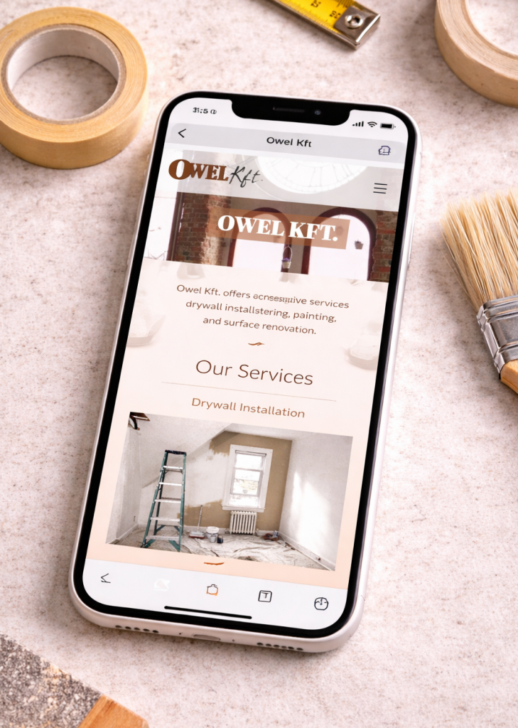
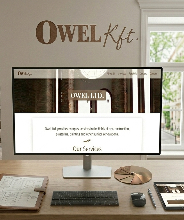
Owel Construction Company Digital Transformation
Project Overview
The Project
Owel Company is a premium construction firm specializing in high-end building and renovation services. This project focused on transitioning the brand from a limited offline presence to a comprehensive digital platform that reflects their craftsmanship and reliability.
The Problem
The company lacked a professional digital touchpoint, creating a gap in brand perception. Potential clients had no way to verify the quality of Owel’s work online, and the absence of a structured inquiry system meant the company was losing out on high-value leads.
The Goal
The primary goal was to transform Owel’s digital presence into a high-conversion asset. I sought to bridge the gap between service quality and online perception by creating a credible, high-fidelity interface that guides users through a clear value proposition and a streamlined quote-request funnel.
My Role
Project Lead/ UX Designer/ UI Designer/ Brand Designer/User Research
Responsibilities
User Experience and Interface Design / Brand Design / Project Management / User Research
Research
Summary
The goal of this research was to understand the high-stakes decision-making process of premium construction clients. In the luxury renovation and general construction market, users aren’t just looking for a service they are looking for reliability, proof of quality, and professional communication. This research aimed to identify the specific trust signals required to convert a casual visitor into a qualified lead.
Methodology
Stakeholder Interviews: I interviewed the Owel team to define business KPIs (e.g., higher quality leads over volume) and understand their existing sales cycle.
Competitive Benchmarking: An analysis of three local and two international high-end construction firms to identify industry standards for navigation and portfolio presentation.
User Interviews (n=5): Conducted semi-structured interviews with homeowners and property developers who had recently hired contractors.
Insights
The Finding
Stakeholders required a very minimalist aesthetic and the project was governed by a strict, short-term deadline that left no room for complex features or heavy decorative UI.
The UX Strategy
I turned these constraints into a design advantage by adopting a High-Fidelity MVP. I proved that a "Minimum Viable Product" can still feel like a luxury experience when the focus is placed on typography and high-quality imagery rather than unnecessary complexity.
The Finding
I recognized that premium clients prioritize visual proof over dense text
The UX Strategy
I designed a minimalist, image-driven interface that prioritizes high-quality project visuals to communicate expertise and establish brand trust at a glance.
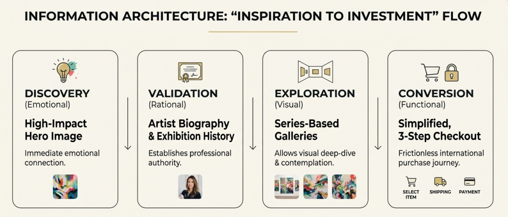
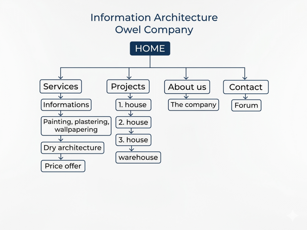
Information Architecture
Summary
I developed this IA to streamline the lead generation process. By creating a direct vertical path from service education to price inquiry, I ensured that the user journey remains focused on the primary business objective: converting informed visitors into high-value project leads
Wireframes
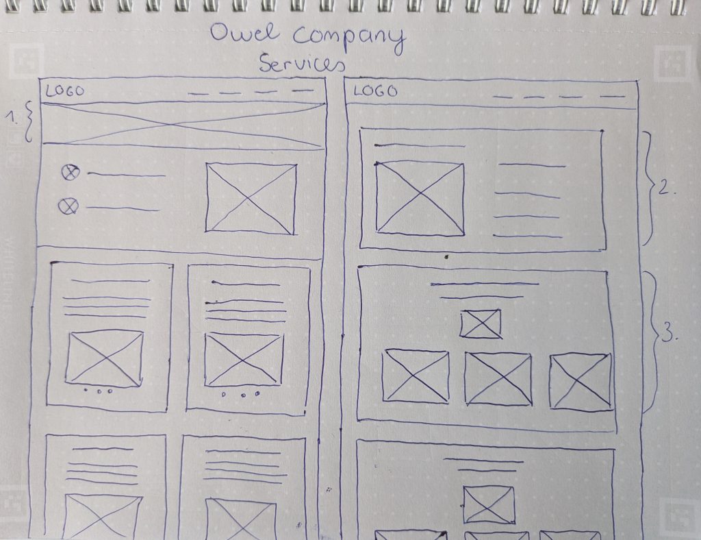
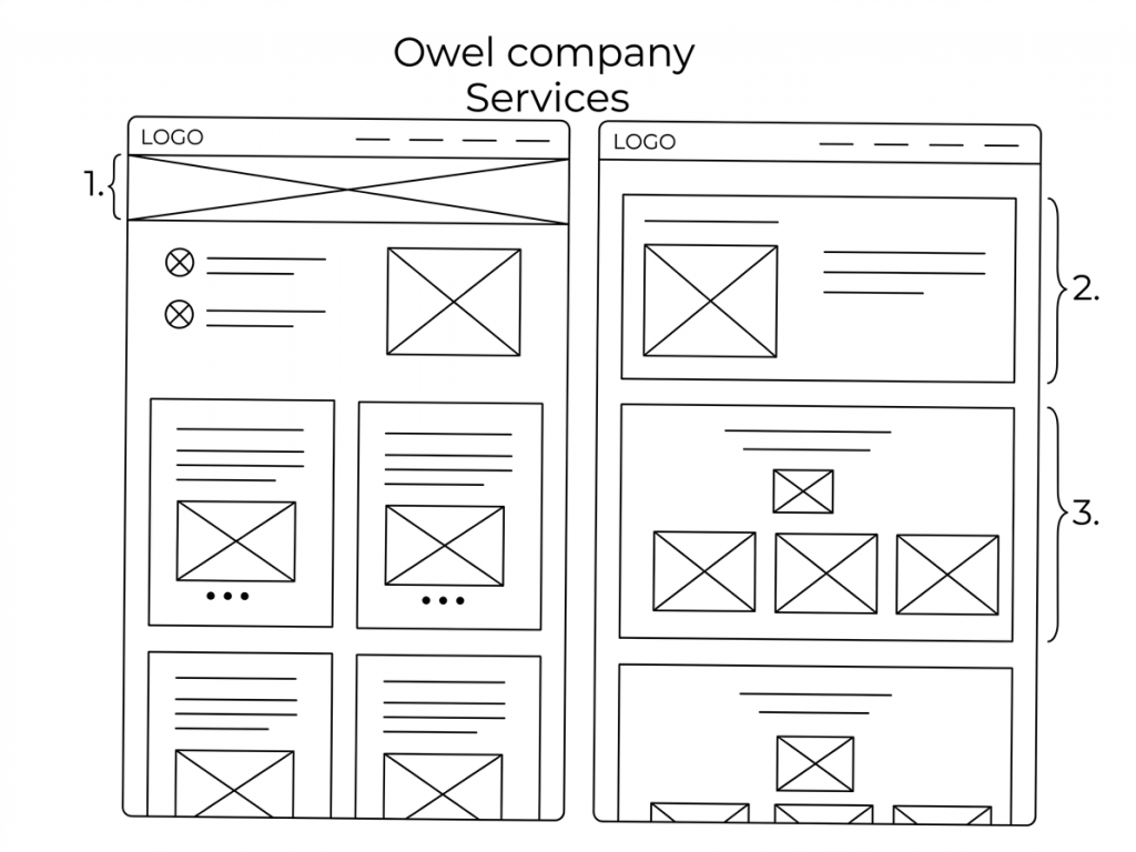
Selecting the Right Layout: The Power of Parallel Design
For the Owel company website project, I used parallel sketching to quickly generate and compare two different Services page architectures.
Layout A (Hero + Grid) was optimized for visual engagement and quick information recall.
Layout B (Detailed Interleaved Sections) was optimized for detailed description and linear content flow.
Rather than discarding one idea, I synthesized the two. We determined that the big-picture hero element (Annotation 1) was essential for brand storytelling. We paired this with a modified grid structure that incorporated the detailed, card-based approach (Annotations 2 & 3) from the second layout, creating a finalized digital wireframe that is both engaging and comprehensive.
Visual-First Authority: Recognizing that premium clients value (proof over prose,) the layout prioritizes large, high-quality project imagery.
Minimalist Luxury: To meet the stakeholder requirement for a minimalist aesthetic under a tight deadline, the UI avoids heavy decorative elements.
Responsive Credibility: The seamless transition between the desktop and mobile mockups ensures that the brand’s luxury experience remains consistent across all touchpoints.
Accessibility Considerations
Simple Navigation
The menu is straightforward and consistent, making it easier for users with cognitive disabilities to find information.
Semantic Structure
The site uses basic HTML structural elements (headings, menus, and sections) which help screen readers understand the page layout.
Takeaways
What I have learned
Trust Building Through Visual Evidence
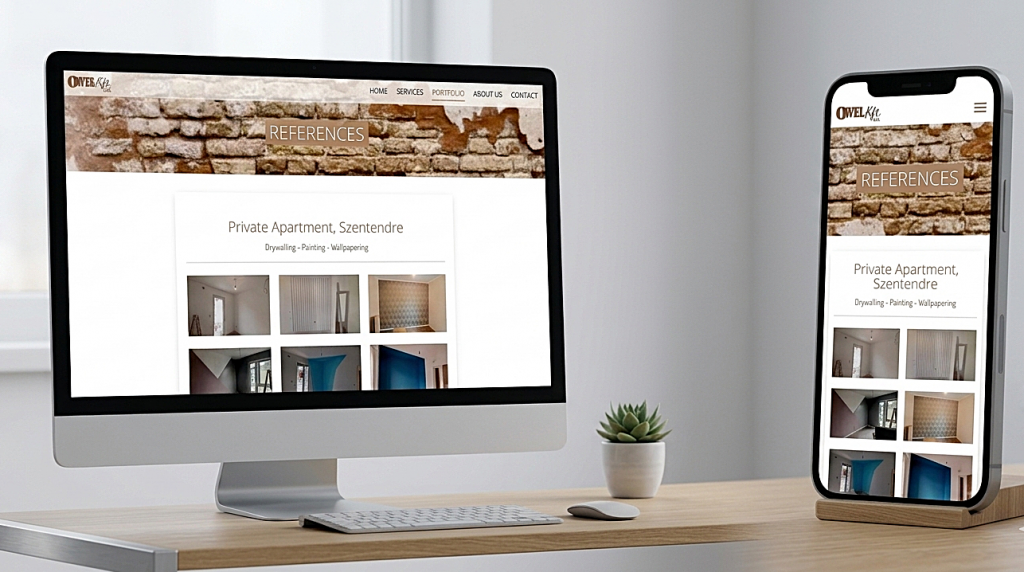
Construction is a high-trust industry. Owel.hu focuses on a Our Work section which acts as a visual portfolio.
Takeaway: The use of high-quality imagery of completed projects is more effective than any paragraph of text.
UX Lesson: For physical services, “show, don’t tell.” A clean grid of project photos provides instant social proof and demonstrates technical competence.
The Power of Clarity Over Complexity
For service-oriented businesses like dry construction, users arrive with high intent. They want to know: What do you do? and Can I trust you?
Takeaway: The homepage uses a simple hero section that immediately defines their services (drywall, painting, wallpapering).
UX Lesson: Don’t make the user “work” to understand your business. A minimalist approach reduces cognitive load and ensures that the core value proposition is the first thing seen.